DESIGN SERVICES
At i4 Integrated Services Limited, great design isn't decoration, it's a strategy you can see. Our Design Services help brands look as sharp as they perform, from first impression to full user experience.
- Research-led, not template-led
- Figma files and assets handed over
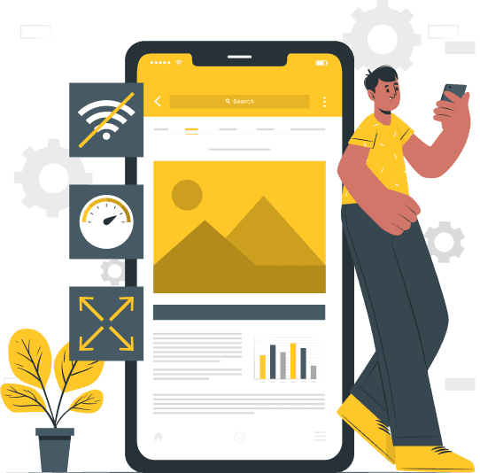
Bad design is expensive in ways that never reach the design budget
It surfaces as support tickets, abandoned journeys, low adoption, and development rework — all of it traceable back to decisions made before anyone wrote code.
Where products start
Designed without evidence
- Complex, unintuitive interfaces that slow users down and frustrate them
- Inconsistent design elements and journeys that fragment the brand
- Information architecture that makes common tasks hard to complete
- Products designed without user research, then adopted by nobody
- Limited accessibility and responsiveness across devices
- No design system, so inconsistency compounds with every new feature
- Designers, developers, and stakeholders working from different assumptions
Where the engagement leaves you
Designed on evidence, ready to build
- Interfaces shaped by research into how your users actually behave
- One consistent visual language across every screen and touchpoint
- Information architecture and flows validated before development starts
- A clickable prototype your stakeholders can use, not just review
- Responsive, accessibility-reviewed designs for desktop, tablet, and mobile
- A design system and component library that keeps future work consistent
- Specifications and Figma files developers can build from directly
Our Design Services
Comprehensive design solutions tailored for modern digital ecosystems.

Logo Design
Your logo is often the first handshake between your brand and the world. We create clean, memorable, and versatile logos that capture your identity and scale across every platform, from app icons to billboards. A strong logo builds instant recognition and gives every other design decision a solid foundation to build on.
 Custom concepts tailored to your brand story
- Multiple design directions to choose from

Brand Identity Package
Consistency builds trust. Our Brand Identity Package goes beyond the logo to give your business a complete, cohesive visual language, so you look credible and recognizable everywhere you show up. It's the toolkit your team needs to present a unified brand across every channel, without second-guessing.
- Logo suite (primary, secondary, icon marks)
- Color palette and typography system

UI/UX Design
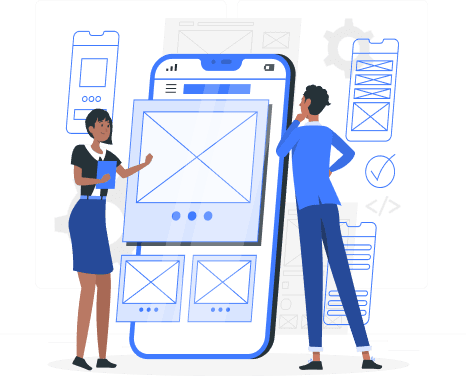
Good design isn't just beautiful, it works. We design digital products that are intuitive to use and effortless to navigate, balancing user needs with your business goals. Every screen is shaped by real user behavior, so your product feels natural from the very first tap.
- User research and journey mapping
- Information architecture and user flows
- Wireframes and interactive prototypes
Six disciplines behind every interface we design
A UI/UX engagement draws on all six. Which of them carry the most weight depends on whether we are designing something new or repairing something that already exists.

User Research
We uncover what your users truly need through interviews, surveys, and behavioral analysis.

User Testing
We validate designs with real users to surface friction points and refine the experience.

Wireframing
We create structured blueprints that map out every element of your digital product before development begins.
Visual Design
We craft aesthetically compelling interfaces and websites, grounded with purpose, hierarchy, and brand alignment.

Prototyping
We build interactive prototypes that bring concepts to life, enabling rapid testing and iteration.
Design Systems
We build scalable design systems that ensure consistency across every product touchpoint.
Six phases, each ending in something you can review
The method above is how we think. This is how it runs in practice, with the artifacts that land at the close of each phase.
- 01
Discovery & Research
Understand the business, the users, and what the competition has already trained them to expect.
What happens
- Stakeholder meetings and design consultation
- Business requirements gathering
- User research and business analysis
- Competitor analysis and project planning
What you receive
- Discovery report
- User personas
- Project brief
- 02
Information Architecture & UX Planning
Decide how the product is organized and how people move through it, before anything is drawn.
What happens
- Information architecture and sitemap development
- User journey mapping
- User flows and task flows
What you receive
- Information architecture
- User journey maps
- User and task flows
- 03
Wireframing & Prototyping
Get the structure right in low fidelity, where changes cost minutes rather than sprints.
What happens
- Low and medium-fidelity wireframes
- Interactive prototype development
- Stakeholder review sessions
What you receive
- Approved wireframes
- Interactive prototype
- 04
Visual UI Design
Apply the visual language across every screen and build the system that keeps it consistent.
What happens
- High-fidelity interface design
- Responsive layouts for desktop, tablet, and mobile
- Brand integration
- Design system and component library development
What you receive
- High-fidelity UI designs
- Design system
- 05
Design Validation & Iteration
Put the design in front of real users and fix what they struggle with, while it is still cheap to fix.
What happens
- Usability testing
- Accessibility review
- Stakeholder feedback consolidation
- Design refinements and final approval
What you receive
- Validated UI/UX designs
- Final design approval
- 06
Developer Handover
Hand the design to engineering in a form they can build from without interpreting it.
What happens
- Design specification preparation
- Asset export and organization
- Handover documentation
- Knowledge transfer session
What you receive
- Figma source files
- Exported design assets
- Style guide
- Handover documentation
A complete design blueprint, not a folder of screenshots
Everything is organized for stakeholder review, developer handover, and whoever picks the product up two years from now.
The design pack
- User research findings
- Information architecture and sitemap
- User journey maps and user flows
- Low-fidelity wireframes
- High-fidelity UI designs
- Interactive clickable prototype
- Responsive designs for desktop, tablet, and mobile
- Design system and reusable UI component library
- Style guide covering color, typography, icons, and spacing
- Developer handover documentation and design specifications
- Figma source files and exported design assets
Designed and reviewed in
- Figma
- FigJam
- Miro
How the design is validated
Quality assurance in design means checking the work against users and standards before it reaches development, where every change costs more.
- Usability testing with representative users
- Accessibility review against recognized standards
- Responsive verification across breakpoints
- Design system consistency checks
- Stakeholder review at the close of every phase
- Developer feasibility review before handover
Why organizations bring design to i4
Design is the cheapest place to change your mind. These are the things that decide whether that advantage gets used.
Research before pixels
Personas, journeys, and competitor analysis come first. A beautiful interface built on a wrong assumption is still wrong.
A design system, not just screens
Reusable components and a documented style guide, so the twentieth screen stays consistent with the first — including the ones we never designed.
Accessibility and responsiveness in scope
Reviewed across desktop, tablet, and mobile and checked for accessibility as part of validation, not raised as a defect after launch.
Tested with real users
Usability testing before handover, so friction is found by us rather than by your customers in a review.
Built for the developers who inherit it
Specifications, exported assets, and Figma source files, so the build matches the design without a translation layer in between.
Fewer changes during development
Validating the design first is what keeps expensive rework out of the implementation phase. That is the commercial case for doing it properly.